

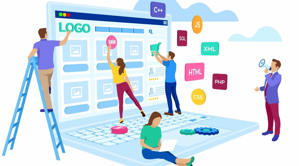
Web Developers have begun to produce websites as works of art, interactive projects, and also sites that are only for entertainment and play. This brings to mind the early days of the internet when web designers just looked for ways to flaunt cutting-edge methods or build websites only for their own enjoyment.
Web design trends are recreating that time period visually. Outside of the more photograph-centric layouts that have been the norm, web designers today are discovering new forms of creativity. Instead, these designs make clever use of typography, grids, and lines, as well as straightforward accessibility. Sites are kept from feeling too retro by updated aesthetic, which includes subtle colors, sophisticated textures, and new sophisticated fonts.
With cutting-edge modern techniques like smart interactions, animations, and visual effects like glassmorphism and grain, web design is likewise evolving into the future. Additionally, some web designers are employing no-code tools to make the process faster and a lot easier than before.
Here are a few web design trends that we think will be significant in the following year:
App-like experiences
These kinds of more compact, user-centered websites are the future of web design. An app-like front-end-driven web experience is a completely new way to use the web that has never been done before.
Because of apps, where interaction, animation, and dynamic experiences are the standard, the world has grown accustomed to them. Bringing that enthusiasm to websites and developing more distinctive experiences there is the logical next step.
Some believe that we are moving toward a period when websites were mysterious, and intriguing. However, the creation of dynamic, interaction-focused designs is now much simpler thanks to new website construction technologies like no-code.
Experimental Navigation
Experimental navigation can encourage and direct users to navigate the website in a specific way.
Navigation techniques that differ from the conventional pattern are referred to as experimental navigation. These test patterns can help build curiosity and direct people to navigate the website in a particular way.
Sites with a strong sense of place
Some websites appear to be becoming more geographically aware. On homepages and in the “about” parts of websites, there are pictures of places that draw attention to the towns, cities, and natural areas close to the creators’ homes.
The internet can be a remote environment where you frequently have no connection to the source of the website you’re visiting. Visitors are prompted to visualize where you are and feel a little sense of connection to the actual world or include a photo of your favorite local location. Even if we haven’t been travelling as much, at least we are aware that we are connecting with people online all over the world.
Mini-sites
Comedy may take many different forms, and creating a website that makes people laugh is indeed fun. Why not experiment with your build for fun?
Early on, Pixar started allowing animators enough time to do a short film in addition to each feature film they created. With no pressure from their feature projects, these shorts offered an opportunity for animators to be more relaxed and creative. They ultimately produced a good number of innovative technologies that advanced the animation industry. Website developers are learning they can accomplish the same with their websites.
Making playful mini-sites provides designers the freedom to express their creativity freely, to explore and try out new design strategies, and to go all out without worrying about overdoing it on a paid project. A fantastic method to break out of a slump is occasionally to create for the sake of creating.
You can dabble in a variety of ways. by consciously breaking expectations or creating an intentionally playful UX design. Add fun to the site’s navigation, menus, and user interactions in addition to the copy and graphics. Be cautious. Make it appear to be a professional website. This is a chance to design a website that works in new directions.
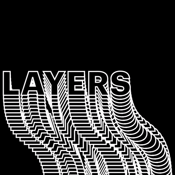
Kinetic Typography
Visitors will be charmed by kinetic typography, which can also aid in content consumption.
Kinetic typography, sometimes known as moving text, is an animation technique that has been around since the 1960s, when animated opening titles first appeared in feature films. When a visitor lands on the homepage of a website, it can be used for a similar purpose to capture their attention right away.
Additionally, Kinetic typography can be used to draw attention to key areas and direct visitors as they scroll.
Interactive fonts
Some designers have been coming up with inventive ways to have their text move and interact with the user’s mouse, taking the use of text even farther. Applying a hover-state change, much like you would with a button, is a simple approach to make text interactive. It helps because using contemporary no-code platforms made it a lot easier than it once was to try to write these by hand. It’s crucial to consider readability and clarity when incorporating interactivity into fonts because some viewers may become distracted by moving characters.
We are so excited to see how these are implemented in 2022!
We really loved browsing the websites that served as the basis for our list. As designers ditch some of the patterns that have become so dominant in past years, we predict a year of playfulness and creative modification. We look forward to seeing the new web designs in 2022 and how online marketing will look in the future.
________________________________________________________________________________________________________________
6 Popular Design Trends for 2020
Web design trends are always evolving and, in a world where competition for our attention is fierce, it’s no surprise that in 2020, web design is about delivering a clear message quickly and standing out among the constant barrage of information, images, and brands.
As the technical possibilities become seemingly limitless, designers are free to creatively reinvent past design elements, experiment with extreme ideas, and try new techniques.
Web design trends for 2020 are about creating websites that are striking and modern, with rich visuals and content, without being crowded and messy. Most of all, these trends can help you create a website that’s up-to-date and in line with a clear, concise, and solid brand.
Here are 6 popular design trends for 2020:
1. Unique Custom Illustrations That Add Personality to Your Brand
Although illustrations are a common design element often used on websites, there is a growing trend of creating custom, detailed, and even hand-drawn illustrations that are well-thought-out and that tie the website and branding all together.
You can pair and overlap illustrations and original graphics with real photographs to create a unique, catchy visual that helps you express your creative vision more clearly. You can also add a little animation to grab the viewer’s attention. All these tools are an effective way to add charm, character, and a personal touch, which can help create brand identity.
For best results with this trend, make sure the style of the illustrations and visuals match with your brand identity. The style helps the viewers understand your message and the brand image you’re trying to achieve. For example, you might use geometric, clean, detailed shapes for a more refined look and cartoonish, squiggly lines for a more playful, fun look.
Once you understand the power of a well placed illustration, you can utilize this trend to really define your brand.
2. Drawing Inspiration from the Past; Vintage and Retro Themes with a Modern Twist
Another common trend for 2020 is drawing inspiration from vintage and retro styles. The idea is to use certain vintage and retro elements but reinvent them with a modern twist.
Vintage or retro themes communicate a feeling of nostalgia and certain design elements like vintage colors or retro type can be used on websites to convey this feeling to viewers. If nostalgia is part of your brand image, then this trend is on point for your web design.
It’s important to remember, when using this trend, that choosing one or two elements is best rather than going full vintage. This gives your website a vintage influence but keeps it feeling modern instead of dated.
Think vintage-influenced typography with a vintage-inspired color scheme, while maintaining an overall modern look.
3. Solid Framing and Color Blocks
In 2020, designers are leaning more and more toward using solid color blocks and experimenting with the use of white space, as well as different colors, in order to create more structured designs and clean framing. Aside from giving the design stability, it creates a canvas from which the images can pop.
This trend makes use of wide frames and white space to create neatly structured web designs, which allows each design element its proper place on the page. The solid framing and color blocks of space gives the website a pleasing, satisfying order and sets up the visuals to be center stage.
In this way, you can showcase images in a cohesive composition. In order to tie everything together, make sure to use your website and branding color scheme throughout, in various shades, for a unified look.
As with all design trends, try not to go overboard. You want a structured, consistent composition, where all the visual elements complement each other, not a disjointed mess of blocks and frames.
4. Futuristic Color Schemes
Web designs are becoming more daring and bolder, with glow-in-the-dark neon colors and strategic, futuristic color schemes that give designs a luminous effect and create the feeling that the images are jumping right off the page.
Pair that with other trends that are gaining momentum, like dark mode and minimalism, and these glowing, luminous colors really stand out!
Combine fluorescent colors with digitally rendered 3D artwork, which is also on the rise, and the end result is an exciting, engaging, futuristic looking website. And, like the custom illustrations mentioned earlier, this is another way you can add personality to your website and brand.
Again, keep in mind to tread carefully with this design trend. Moderation is key. Add a few fluorescent or neon colors that compliment the rest of your color scheme. They should not be your primary color palette, but rather used as secondary colors and balanced out with neutral colors like white, black and gray.
5. Oversized Images, Elements and Fonts
This trend is about getting your message across loud and clear. Nothing gets attention faster than oversized, prominent elements and typography. It can be applied to any aspect of the website, from full screen images and videos to large, bold typography.
Oversized images and elements are striking and attractive, and can help viewers understand instantly what the website’s all about. Opting for a full screen image or video paired with large typography is an efficient way of getting your message across and ensures that the most important information is reaching your viewers right away.
The added benefit is that this trend works and looks great on any screen size. For this trend to really work in your favor, stay away from too many large elements all at once, which can be overpowering, chaotic, and counterproductive. Keeping the number of design elements on each page to a minimum will ensure your success with this trend.
6. Exposing the Grid
Web designers are starting to draw inspiration from design elements that have, in the past, been reserved for behind-the-scenes only. Websites are most often designed using an invisible grid system that keeps all the elements on the page organized.
In 2020, it seems these grids are coming to the forefront and instead of just being hidden background design tools, they’re being used as primary design elements.
The grid as a design aesthetic instead of simply a design tool is a brilliant idea. It’s a callback to iconography that we are already familiar with from operating systems and apps and it can give your website a clean, modern look that viewers recognize and are comfortable with.
Rectangles, squares, and lines divide the screen into sections, and can guide the viewer’s eyes in the desired direction. They can add depth and dimension, and be visually pleasing. The grid and its building blocks are now exposed and it’s a great way for viewers to navigate and enjoy a website.