Must-Have Features and Designs for Agents and Brokers
Thinking of a makeover for your real estate website? Perhaps you’re building one for the first time. This is probably the most important resource you will ever invest in, and you have to nail it. To stand out from the competition, your website must be strategic, convenient to use, and packed with the right features. Here we discuss the benefits and some of the best features that will place yours among the top real estate agent websites.
Benefits
The benefits of having an excellent real estate website design are many in number, and they can all be realized with a proper concept. Some of these benefits include:
- Generate more leads with proper online tools which capture visitor contact information and wish-lists.
- Provide more exposure to your properties.
- Tell them about you as a person, so they can relate and trust you as an individual.
- Tell them all about your business, and how it operates, including areas of specialization.
- Transform your name and logo into a marketable “Brand”, not just another broker among thousands.
- Use the site as part of the listing presentations that are prepared for your new clients.
- Exchange information easily with the public. Make your announcements and collect their feedback.
- Build a strong web presence. Get found easily and instantly, via Google searches. Have your contact info, current listings, and specialization displayed at the click of a mouse. Show up in more places, under more categories, associated with strategic keywords.
Features & Characteristics
Plan your top real estate agent website around a smart marketing strategy that includes these crucial features:
Search Engine Optimization
The most important element of your real estate marketing efforts, SEO strategy is crucial for every real estate agent website. There is a science to this, and expert SEO services should only be handled by the best, to get you ranked highest and generate more traffic on the site.
Lead Capture and Management
The ability of your website to create new sales opportunities is the best measure of its effectiveness. Lead capture management tools like customizable fields and interactive maps encourage user engagement, and effectively create sales lead databases for you. These tools should blend seamlessly with the website’s overall design, yet still be visible enough to catch their attention. Detailed enough, but not invasive when asking for personal info.
Eye-catching Design
A striking esthetic helps draw visitors to the site, keep them there, and share those links with friends. The more pleasant and the longer they stay, the more options they will explore. Just keep it relatively simple, so that the design elements don’t overshadow the actual content or become hard on the eyes. Colour schemes, white space, symmetry, flow, and easy to read typography are all crucial for improving your real estate website.
Detailed Listings
This is like the menu in a restaurant when they’re ready to order. Just enough detail, but not overwhelming or too technical. Enticing choice of words, with nothing negative. Pleasing to the eye, with tempting visuals inviting them in. The property listings on a real estate website are its bread and butter, and must be easy to find, easy to navigate through, and display information in small bytes that are easy to digest. Also make these easy to print, save, or share between potential clients.
Professional Photography and Video
Pictures speak more clearly than words. They should be attention-grabbing, pleasant to the eye and easy to understand. Adding high quality, relevant imagery to a real estate website has always been a must. Don’t forget, these purchases (especially the residential side) are based largely on emotional decisions. Photography and videos inspire attachment and generate emotion. Use multiple angles, proper lighting, show clean uncluttered areas, and rich colours. This helps make your listings more interesting and “real” in the visitor’s mind.
Complement Your Social Media
If a company website doesn’t play off its own social media, and vice versa, there’s no point having both. They might as well be working for two separate businesses. Create reciprocal links for all your platforms which direct toward all the other platforms, especially if that leads to user engagement and lead creation.
Flawless Navigation
For any kind of website, comfortable navigation is extremely important to the user. This includes speed of loading, download times, clean graphics, one-click access, and making all options visible or easy to find. Errors, freezing, and broken links are unforgiveable. Transitions should always be smooth so that your user remains focused on their shopping experience, and not get distracted by frustrating technical issues. Menus must be well-organized and not too complex, with main menu titles and sub-menus that drop down or slide out.
Mobile Friendly Experience
More people today do their browsing on mobile devices than they do on desktops or stationary computers. No longer just an afterthought or cute option for the minority, website design these days a must factor in a mobile-responsive design. Imagery adapted to smaller displays, load times, browsing speed, reduced typing requirements, limited pop-ups, larger type fonts, and “sticky” headers are vital. Just ensure that your website works properly on any device and automatically adjusts to the screen without compromising quality.
Outstanding Examples
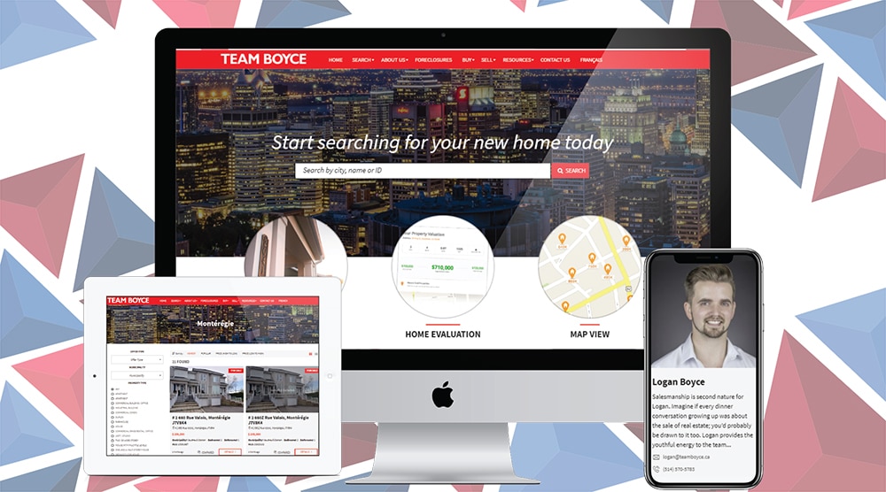
Team Boyce – Beaconsfield, Quebec

Right away you are greeted with fantastic imagery and a clean attractive design, which is easy to process with the eye. An incredible edge-to-edge photo of the city landscape serves as a banner at the top, highlighting a search bar for property queries. The menu bar at top is clear and accessible, encouraging quick easy navigation for the most novice web user. Contact info clearly listed at first glance, and more navigation options are apparent within first screen’s view. Featured cities they service and properties considered Most Popular For Rent and Sale are displayed with full detail, with more graphic clickable options on the home page. An attractive scrollable list of Agents accents the bottom of this page, making all their brokers seem accessible at the click of a mouse.
Property listings are clean and clear, and easily searchable. Navigation between sections is quick and flawless. The contact page is uncluttered, with an interactive Google-powered map clearly displaying their location and a contact form to capture visitor’s personal info. Links to the firm’s Facebook and Instagram pages connect this website to the company’s social media presence, which is a great marketing tactic.
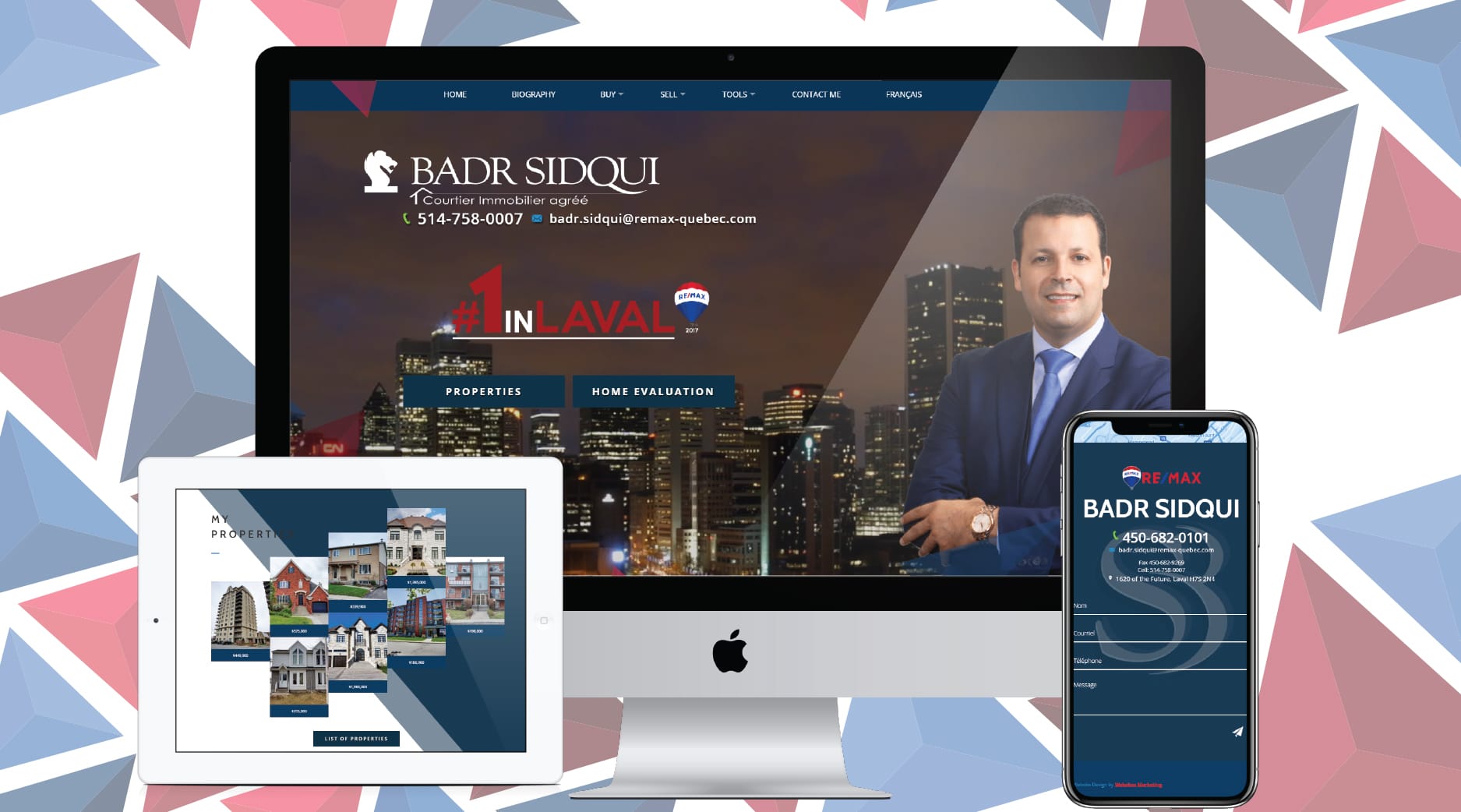
Badr Sidqui Real Estate Broker – Laval, Quebec
This site is visually stunning and instantly draws you in with bold colours and photography. The entire background at the top of the home page is a dynamic photo montage, showcasing the Agent’s city at night. The colour palate is consistent, with contact info big and bold throughout. The menu bar at top is simple and clear, with animation upon hovering your cursor, and all the necessary options to get shopping. Options to browse properties as well as get a home evaluation are prominent from the start, as well as a flattering bio of the Agent. Very smart! A very professional and charming video (powered by YouTube) is presented just below, which allows potential clients to relate to and admire this broker.
Client testimonials are easy to spot (in both official languages), and a contact form to capture potential leads is also at the ready. Navigation is smooth on both desktop as well as mobile devices. Properties are smartly listed in map form, as a gallery, or in a list. Each listing then offers a virtual tour, area map, street view, with nearby amenities listed by proximity.
Tania Ellerbeck – Hudson, Quebec
This web design is easy on the eyes, with a more neutral colour scheme and the initial imagery depicts calming natural settings. A chic introductory video lies below the option for a Free Evaluation of the client’s current home, as well as profiles of the various regions served. Their Featured Properties are well showcased, with large imagery and thorough detail listed within one click. One more click allows for sharing of these properties on Social platforms like Facebook, Google+, LinkedIn, Twitter, and Pinterest. The website itself links to Ellerbeck pages on these, as well as Instagram and a YouTube channel.
A free mortgage calculator for monthly payments is available, alongside other innovative tools like “Make an offer” and “Make an appointment” to enhance the interactive user experience. This site also showcases the always underutilized “Blog” section, with helpful tips, advice, and industry news written up by the Agent herself. SEO is very strong, and a lead capture tool is visible on almost every page, as you navigate flawlessly across the site on your mobile device.
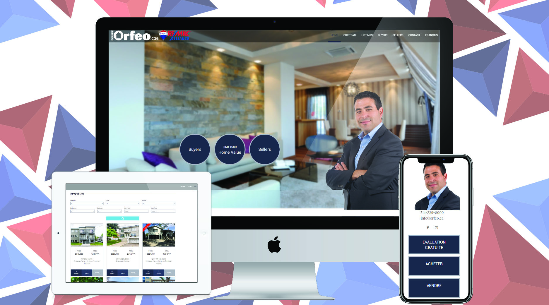
Salvatore Orfeo, Remax Alliance Real Estate Broker – St-Léonard,Quebec
Clearly optimized for prime SEO rankings, this site alternates seamlessly between simplistic black on white and vivid stimulating visuals in full colour. Smooth transitions at every scroll, clean font schemes and uncluttered layouts make time spent on this top real estate agent website very pleasant. This includes great mobile responsiveness whether on tablet, cell phone or other device.
An expanded section of search criteria allows for more advanced searches on properties available. Property listings themselves are detailed and feature beautiful photos that welcome every visitor warmly. Opportunities for user engagement are available on every single screen, greatly increasing that visitor’s likelihood of clicking somewhere or leaving their info behind as a new lead.
“What’s Your Home Worth? FIND OUT FAST AND FREE” is a beautifully laid-out page with 3 step tool that tempts the visitor with the discovery of information about their prized asset. The information featured in the site pages are tailored to real estate audiences of all kinds – from home buyers and sellers, to property investors in general. A sophisticated introductory video and links to the agency’s Facebook and Instagram pages complete the marketing strategy nicely.
Conclusion
Creating and managing such websites requires lots of expertise and hard work. There is a delicate balance between attractiveness and closing new business, and most of the tactics employed aren’t even visible to the eye. Hiring a Digital Marketing Agency for the initial design and support is one of the best investments a real estate agent can make!
To see more of these essential features of top real estate agent websites in action, browse through our Featured Work of newly launched Broker sites.
Get your website design done by the experts. Call Marketing Websites at 514-360-2187 or e-mail info@marketingwebsites.ca for a free consultation.


