It’s 2022, and having a website made for your restaurant is more crucial than ever in the present day. Try following this restaurant website design checklist to get the best results! Designing a restaurant’s website is crucial. Today, every business must have a reliable website, but having one is especially crucial for restaurants.
Everyone is aware that fostering a good user experience while preserving the overarching goal of eye candy is a crucial component of creating a great website. Restaurants achieve this by employing superb photography and design to get customers to visit and try their food.
In addition to excellent photography, another approach is videography, which may capture the busy dining area, the food sizzling and boiling in the oven, or the opulent setting. Color psychology can also be applied since hues like red and yellow are known to enhance the appetite.
A great website is both aesthetically pleasing and useful. When it comes to restaurants and cuisine, aesthetics may easily be overdone, therefore some website designers solely focus on that. Others, on the other hand, simply focus on creating a simple website that gets right to the point. Effective restaurant websites include both visual appeal and usability in their design. Since it’s not always simple to accomplish, many eateries have a rather bad online presence.
The Marketing Websites team has compiled a list of key essential features for restaurant websites. Let’s go through the restaurant website design checklist!
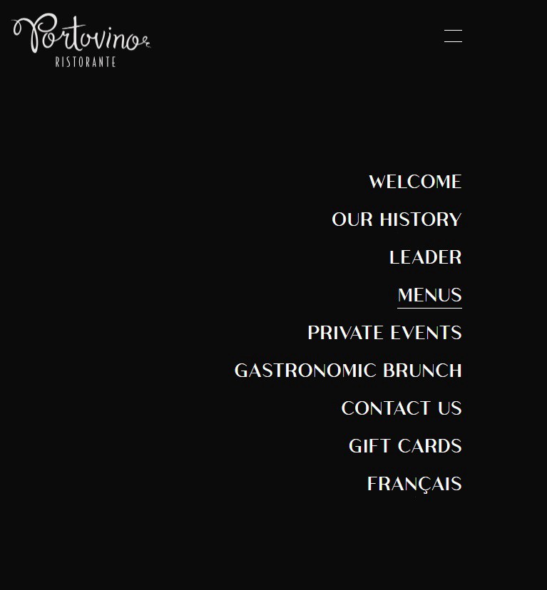
1. Your Menu
A recent survey found that 93% of consumers look over a restaurant’s menu before choosing where to eat. Consequently, it makes sense that you would want a menu on your website.
2. Address, Telephone Number & Business Hours
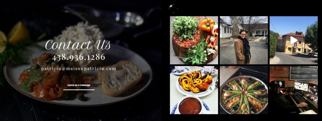
Your address, contact info, and hours of operation should all be prominently shown on your homepage. Make it as easy as possible for your visitors to locate you by not making them click around to find it.
3. Include Eye-Catching Images
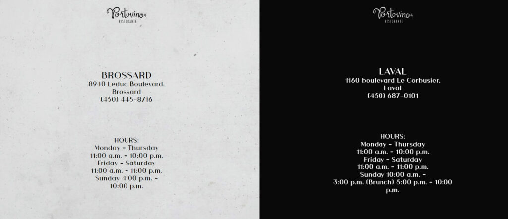
Using pictures to explain your company to potential customers is the best strategy. Images provide guests with a preview of what to anticipate when they visit the restaurant or place an online order. If you can convince website visitors to remark, “Oh, that looks wonderful,” you’ve already won them over.
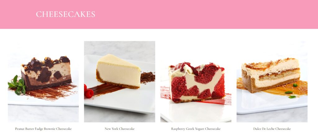
We’re talking about food, and people actually drool when they see something appealing, so they’re inclined to eat it. For this reason, the images you select for your website are also quite important. Use enticing and high-quality images of your restaurant’s food throughout your website pages to elicit this response.
4. Optimize Online Ordering
Recent research found that 82% of customers prefer to order online. That’s excellent news for you, but once they land on your webpage, visitors must find it easy to order from you.
5. Social Media
Creating a consistent brand experience across all channels, such as social media, email, in-person meetings, and your website should be the main emphasis of your marketing campaigns. Additionally, by connecting your social media accounts to your website, you can make it as simple as possible for users to get in touch with you.
No matter the platform, be true to your identity, food, and culture on social media.
Customers often rely on social proof to determine whether or not a restaurant is reputable and legitimate. This indicates that while trying anything for the first time, individuals search for advice from others.
As a result, having social media channels for your restaurant (such as Instagram and Facebook), a customer assessment on Google, or reviewing applications is critical. These channels must be present on your website, not only to provide social proof to your clients but also to improve your SEO.
6. Make Your Website Mobile-Friendly
89% of all restaurant-related Google searches are conducted from mobile devices. This demonstrates how important it is to optimize your website for mobile visitors.
Responsive design refers to the process of building a website with the mobile user experience in mind. This is a design strategy that changes the desktop interface of your website into the optimum format presentation for devices with smaller screens, such as smartphones and tablets.
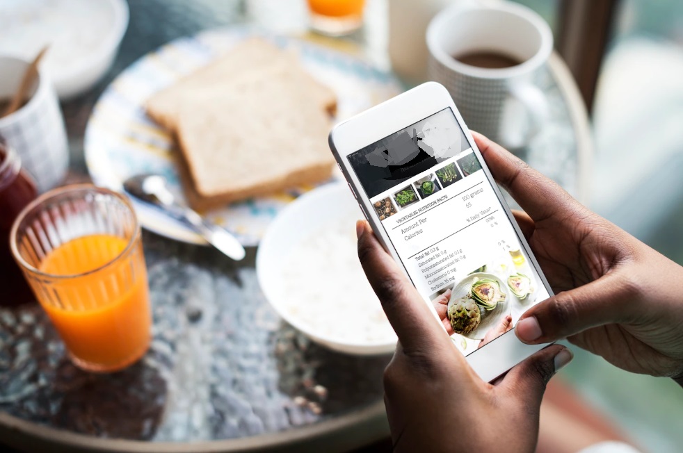
But what does this actually imply in real life? When a visitor uses a mobile device to browse your website, the content will be appropriately scaled for their screen size. The experience will be considerably easier and more entertaining because there won’t be a need to zoom in or out to view and browse through the complete page content.
Given that Google gives responsive websites a higher priority when displaying search results, optimizing your website for mobile visitors is also a good idea for your user experience and SEO strategies.
7. Make Browsing Easy
when it comes to food, consumers want to be able to obtain information fast and easily. As a result, restaurant websites must be easy to browse through.
If you force your visitors to navigate through a lot of content, especially if they don’t know what they’re looking for, they’ll likely give up and abandon your website, which is the last thing you want!
8. Maintain a Faster Loading Time
Every day, website speeds increase, about at the same rate that website users’ tolerance for waiting for pages to load decreases. A page shouldn’t take more than three seconds to load all of its initial content, according to the general guideline. Any longer and there is a considerable likelihood that a visitor may abandon your website, which raises your bounce rate.
As a result, while designing your restaurant website, watch out for a slow page load time. You can do it by following certain best practices, such as reducing the number of HTTP requests, modifying your CSS and JavaScript files, and optimizing picture sizes. If you are not a developer, you can simply examine how quickly your website loads and what needs to be fixed to make it faster.
Conclusion
The identity of your restaurant is more than simply its typeface or logo. It extends beyond the boundaries of your company’s brand. It’s how you communicate who you are, what you believe in, and what your guests may anticipate. by going through this restaurant website design checklist,
A customer who finds you online is equivalent to one who knocks on your door. The issue then is what they will find there. A consistent end-to-end brand experience must be developed across all platforms, including social media, email, in-person encounters, and your website.
By following this checklist, you’ll be prepared to provide useful information to your guests in a timely and effective manner, boosting your odds of them stopping by your restaurant.


